Hypothesis testing
In response to the new reality, advanced health resorts set up a continuous internal development mechanism. This involves: upgrading your facility with new medical equipment; launching wellness programs; updating technologies, tools, and client engagement practices. While this mechanism might go by different names, its core remains the same:
- Continuous innovation. Actively seek new ideas from a wide range of sources, including articles, conference presentations, and successful cases from related industries. While the CEO often drives change, don’t limit this role to just one person. Valuable insights can come from any employee, regardless of their position.
- Initial assessment. Evaluate new ideas based on key criteria: suitability, cost, and complexity. Ideally, involve employees closely related to the project in this process.
- Categorization. Sort ideas into categories based on their potential impact and feasibility: high or low potential, and whether they can be implemented within a week, month, or year.
Once you’ve selected your ideas, they undergo a structured project management process:
- Goal setting and planning: clearly define objectives and create a detailed plan.
- Pilot test: conduct a trial run to test the idea.
- Test results evaluation: assess the pilot phase outcomes.
- Adjustment and scaling: refine the approach based on feedback and scale up if successful.
- Final evaluation and integration: conduct a final result assessment and incorporate ongoing performance metrics into the system.
This approach demands rapid coordination and collaboration across your entire resort team. Delays in analysis, approval, or implementation can cause you to fall behind the market and miss out on potential profits. On the other hand, rushing through the process risks wasting valuable resources.
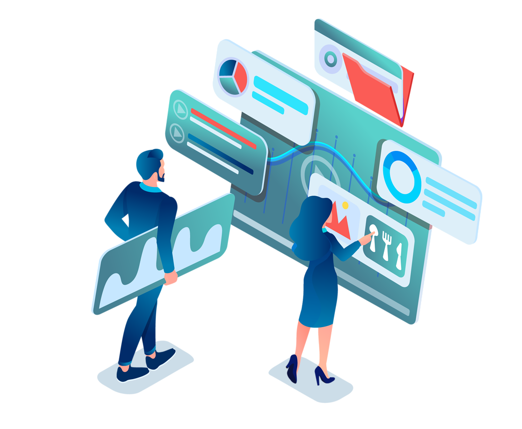
This is where automation comes into play. Where once you could wait weeks for employees to compile data into a single report, now such delays are considered a costly luxury. Automation allows you to quickly determine whether an idea is profitable or not. What tools Jivi offers for hypothesis testing?
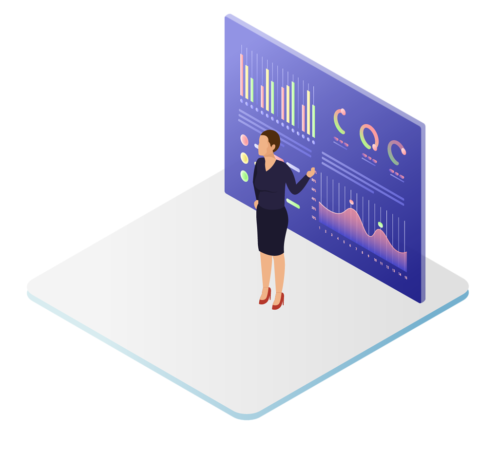
Dashboards
1. Essential for health resort development, dashboards help you quickly and accurately assess experiments’ outcomes. They’re crucial for driving innovation. For instance, if you’ve installed a self-check-in terminal in the lobby, hosted a masterclass for doctors on selling medical services, or updated a script for sales managers, dashboards will show you how these changes affect guest satisfaction and your resort’s financial performance. This allows you to scale successful initiatives and learn from mistakes. With dashboards, you eliminate wasted time and reduce human error. You can access real-time data on facility performance from any device, anywhere in the world, with just a few clicks.
FIM model
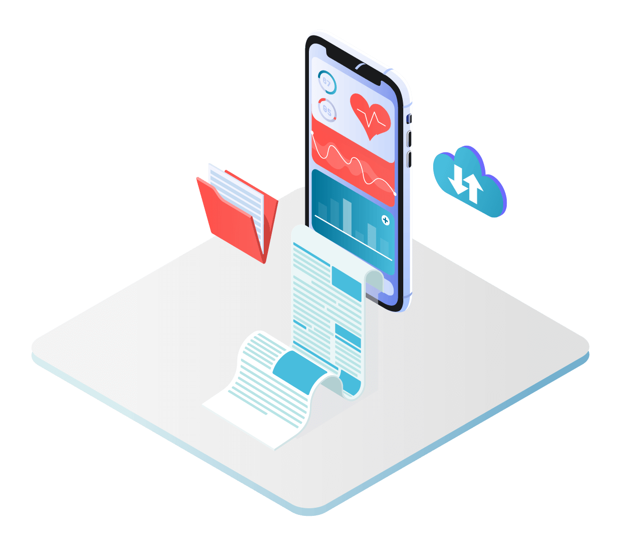
2. Wellness programs are continually enhanced with new offerings. For instance, during the pandemic, resorts widely introduced COVID-19 rehabilitation courses. But how do you measure a new treatment program impact?
Thorough analysis of patient outcomes before and after going through the new program helps identify its strengths and weaknesses. Let’s consider a respiratory treatment program as an example. Patient outcome infographics are stored in the Medical Information System (MIS), allowing you to assess program’s effectiveness. Suppose you’ve treated 100 patients and have the results in front of you. You’re pleased with most figures, except for the «exercise tolerance» data, which shows minimal improvement. This indicates that you can refine the program by adding new treatments or modifying existing ones — perhaps increasing their frequency or intensity. In essence:
- Analyze patient outcomes: compare before and after patterns.
- Identify weaknesses: pinpoint areas for improvement.
- Adjust procedures: make targeted changes to the program.
- Monitor progress: track how indicators change after adjustments.